Quarterly #133: "Does It Make Sense?"
Greiman’s California New Wave typography and mixed-media design had been rocking the Modernist boat for a few years when she undertook a major assault upon the design community’s sensibilities and preconceptions of what constitutes design in 1986, in an issue of Design Quarterly. Published by the Walker Art Center, edited by Mildred Friedman, and directed toward an intermational design audience, each issue of Design Quarterly focused on a specific theme. Greiman was not only the focus of issue #133, she was invited to design it and show her own work.
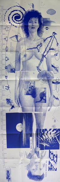
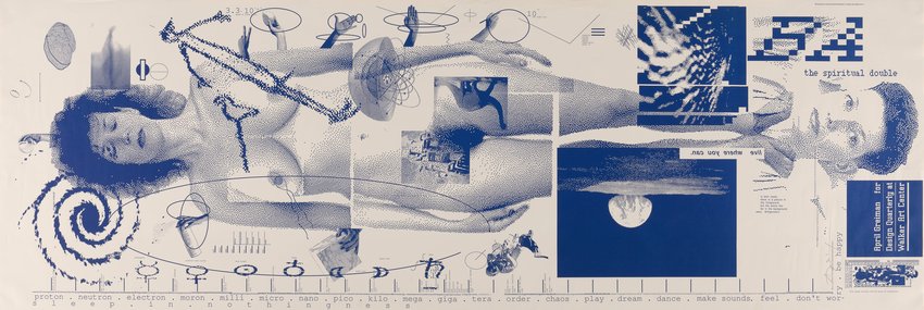
Greiman saw Design Quarterly #133 as an oportunity not only to present her digital work but to ask a larger question of the work and the medium: Does it make sense? Reading Wittgenstein on the topic, she identified with his conclusion: “It makes sense if you give it sense.” She says, “I love this notion which exists in physics as well—that the observer is the observed, and the observed is the observer. The tools and technologies begin to dictate what and how you see something, or how the outcome is predictable. These ideas bring back the kid in me, that very pure curiosity.” Greiman’s piece challenged existing notions of what a magazine should be. Rather than the standard thirty-two-page sequence, she reformatted the piece as a poster that folded out to almost three by six feet. On the front is an image of Greiman’s digitized, naked body amid layers of interacting images and text. On the back, colorful atmospheric spatial video images are interspersed with thoughtful comments and painstaking notations on the digital process—a virtual landscape of text and image. Beyond considering whether digital technologies made sense, the Design Quarterly poster seemed to embody the disillusionment of a nation deeply wounded by the Vietnam war and shaped by the growth of feminism, spiritualism, Eastern religion, Jungian archetypes, and dream symbolism. “Does It Make Sense?” was also an astounding technical feat. The process of integrating digitized video images and bitmaped type was not unlike pulling teeth in the early days of Macintosh and MacDraw. The files were so large, and the equipment so slow that she would send the file to print when she left the studio in the evening and it would just be finished when she returned in the morning. One morning, after she had arrived and was assembling the tiled image, it was clear that something big was missing. For some reason, her body had not printed, though everything else was there. While the technical details of the mystery of the missing body remained unsolved, its later reapearance on the pages presented another problem—Greiman didn’t like the way her right breast looked. The reproduction process had flattened her and the light was strange. So, in what may well be the first MacDraw breast replacement; she cloned and floped her left breast and placed it on the right side of her body.
Before the apearance of “Does It Make Sense?” designers widely considered bit-maped type and imagery not only unorthodox but unacceptable, straying too far from the clean, crisp precision of the Intermational Style. The computer itself was viewed as cold and unfriendly, wildly expensive, and a harbinger of the demise of fine design. After the publication of Design Quarterly #133, many designers felt compelled to reconsider the role of the computer in design practice. Greiman’s willingness to ask the question, and to place it at the center of the design community, triggered countless debates about computers, context, and creativity.
Greiman warmly recalls receiving a phone call from Massimo Vignelli soon after he saw the poster. “I have just one question,” he said. “When do I get the other side?” A Modernist’s query? Perhaps, but more clearly an indicator of the departure Greiman had made from the coolly classical to the intensely personal, poetic, and digital, and in particular of the giant step that she had boldly taken into what had been very much a man’s world.